
Role
Overall planning
Page structure
Content planning
Page layout
Detailed design
Detailed feature work
Summary
The new website aims for a professional tech-industry style, conveying stability for global expansion. I contributed to planning the page structures, crafting texts and engaging in detailed design work. Additionally, I developed specific features, resolving errors, and analyzing and addressing additional features post web development.
Type
Web/Mobile
Overview
While using Wix in Korea, we experienced slowness and instability when editing individual elements, especially
as the website became heavier. This prompted the need to migrate to another web platform. Originally focused on introducing
our company, the site required a makeover to highlight our evolving product commercialization. With plans to expand
our business globally, we decided to create new versions of the site in both English and Korean.
The direction for the new website was clear: attract potential customers with a focus on professionalism.
Given the critical nature of professionalism in the tech industry, the goal was to establish a clean and cohesive aesthetic,
aligning with the typical style of technology company websites.
This approach aimed to convey a sense of stability and expertise, essential for our tech-focused company.
Page planning
With the goal of more actively showcasing the company's products and technology, discussions were held to cover sections
on the main page, including company information, product and technology introductions, and a contact section.
To streamline the page structure, essential sections such as Company, Technology, Product, Inquiry, Recruitment, and News/Notice were minimized.
The purpose of each page was to ensure that users could easily understand the information by clearly separating the sections.
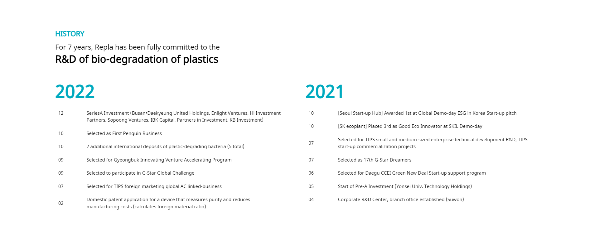
For the Company page, it was planned to cover general overviews, history, team members, management philosophy, and CI.
To maintain site simplicity, a single-page layout with anchor navigation was planned, allowing users to move to each section.
Sections were arranged based on user curiosity and importance, with attention to a visually appealing layout.
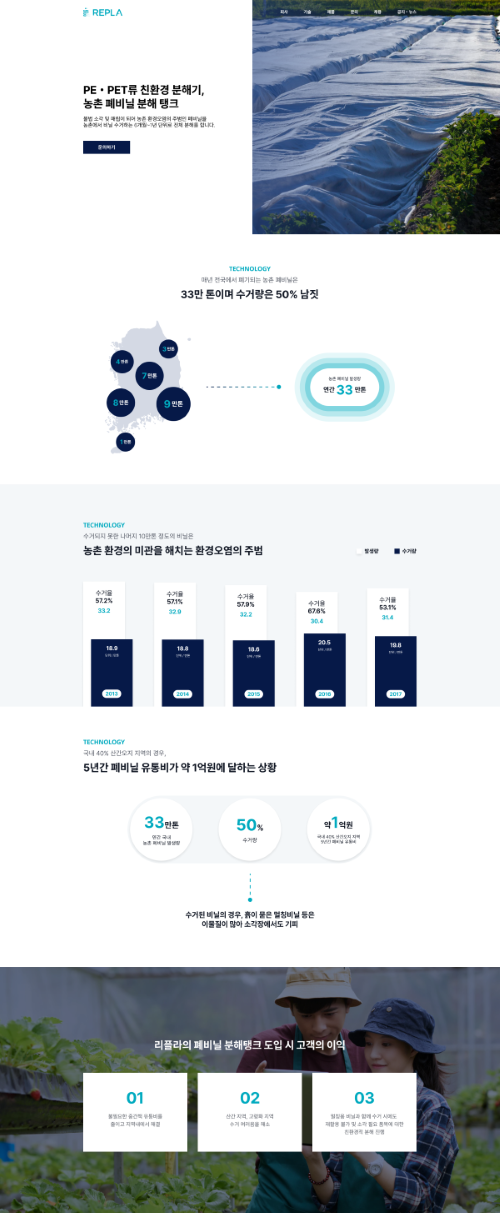
To introduce the ongoing development of the agricultural plastic decomposition tank,
The page was structured into sections such as the main banner, a detailed description of current problems
and challenges, and an explanation of the benefits provided by the company's technology.
This approach aimed to create an impression where potential customers recognize the need for the product
and understand the advantages of utilizing the technology, generating interest.
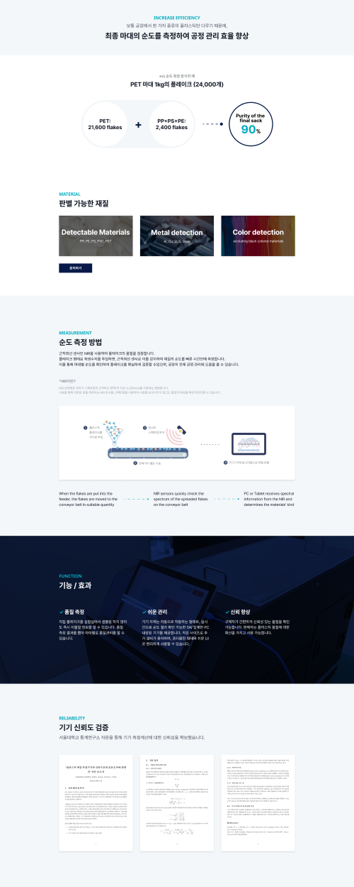
For the Purity Measurement Device page, I handled content organization, image design, text writing, and page structure.
Sections included the main banner, a summary of the product's effectiveness, an introduction to measurement methods,
detailed device features and certifications, and a specifications section.
Text and images were used to summarize content intuitively, allowing users to quickly grasp the product's benefits and encouraging further exploration.
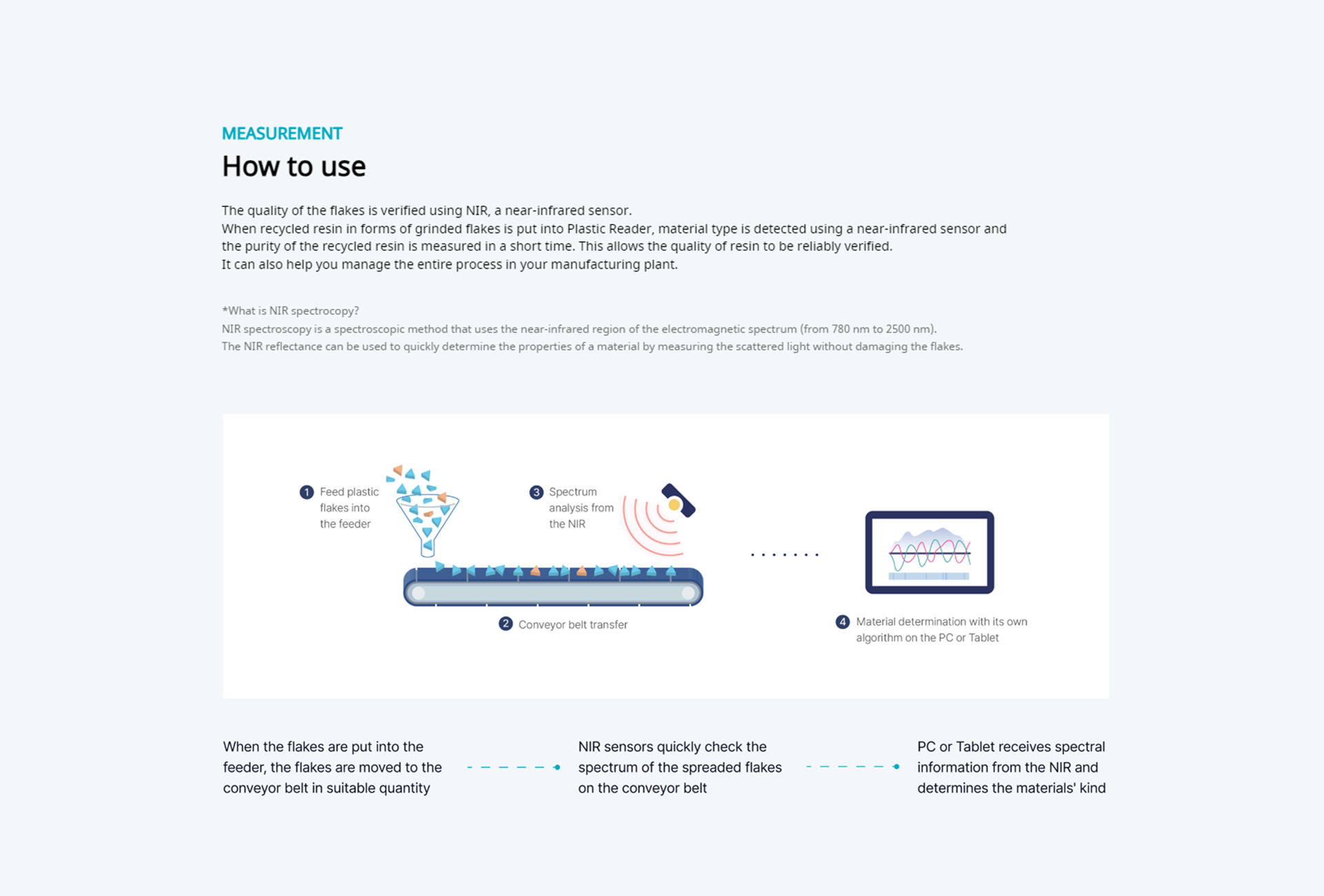
Introduction of measurement methods aimed to enhance understanding, increasing trust and reliability.
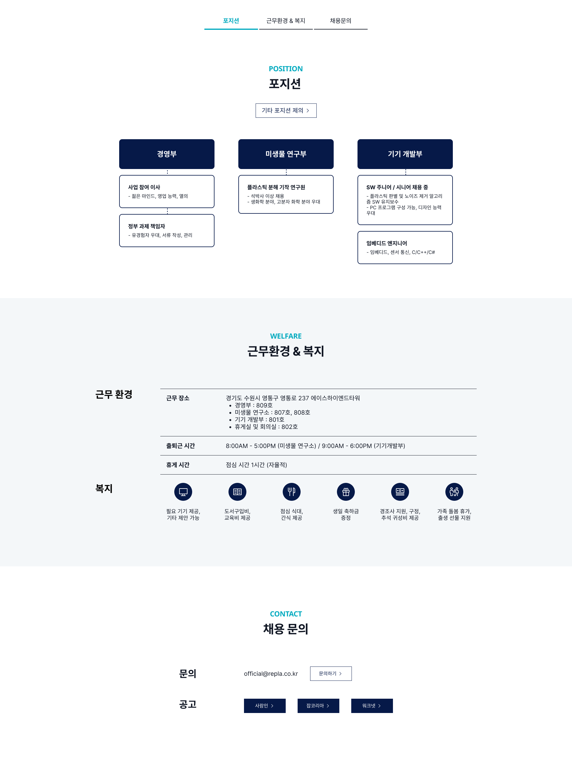
For structuring the content for the recruitment page, Information was organized into sections such as available positions,
working environment and benefits, and contact details for inquiries. The layout was designed to enhance user experience
by clearly separating sections, allowing easy access to the desired content. I planned The welfare section with icons
to increase visual importance, leaving a positive impression on candidates interested in the recruitment process.
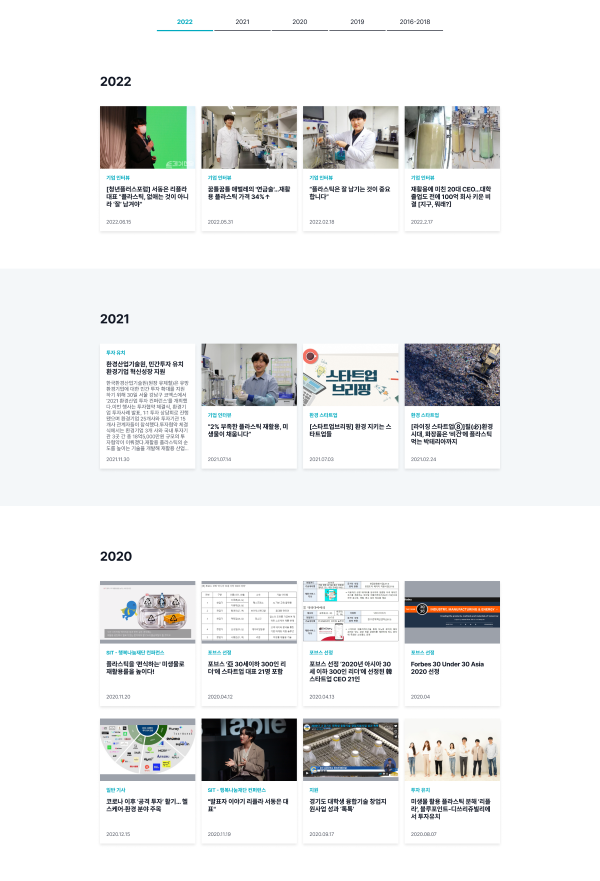
For the News page, I clearly divided sections by each year, and created templates for detailed design of each section.
Each news item was presented in a gallery-style format with text at the bottom, featuring a representative photo
chosen as the news image. Text included categories, titles, and dates for easy understanding at a glance.
Additionally, I created the template for a text-only format for cases without news photos.
Iterative Enhancement
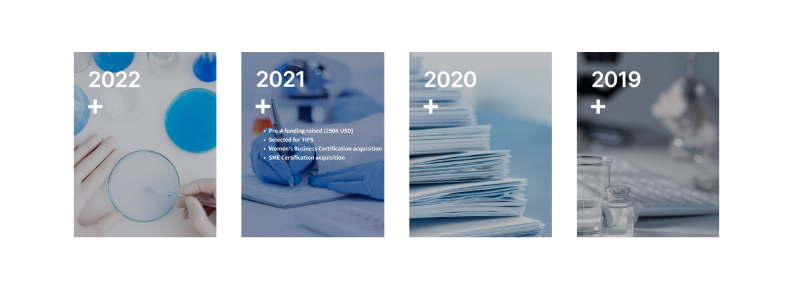
After completing the website development, I conducted various tasks to enhance its overall performance. These included search engine optimization, content modification, and addition uploads, popup creation, and adjustments to menu colors for a more suitable appearance. In optimizing the user experience, I also improved the interaction with the year history box on the main page. Hovering over the box reveals a brief description, and clicking seamlessly transitions users to the detailed history section on the company page.
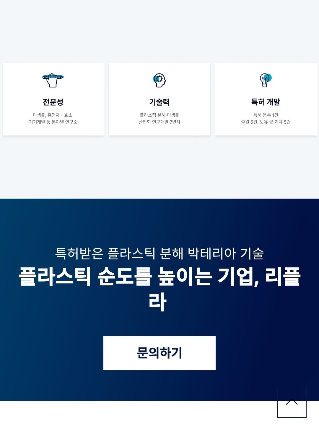
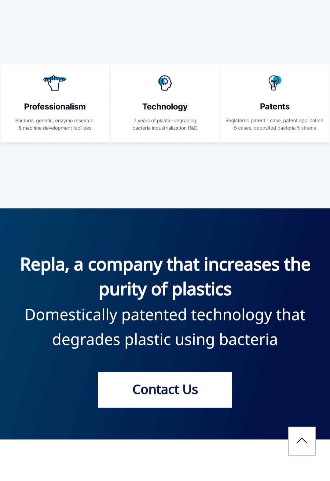
Additionally, I addressed a visibility concern with the transparent top button by adjusting its color to white and implementing a feature causing it to fade away after a few seconds. This modification enhanced clarity and ensured a more visually appealing interface.
Outcome and Learning
After developing the website, we experienced an increase in investment inquiries and a willingness
to purchase our products. Additionally, we were able to introduce our products and company
to a global audience. The enhancement of our brand identity enabled us to formulate a cohesive brand
strategy based on the website.
Through this process, I gained insights into designing a unified strategy for a professional tech website.
I acquired valuable experience in creating a bilingual site, exploring various platforms, conducting research and analysis,
adapting quickly to necessary coding and functionality requirements for maintenance.
Furthermore, post-development analysis allowed me to learn how to continually enhance the user experience.