
Role
Page structure
Overall concept design
Page layout
Detailed design
Summary
The firmware for recycling factory users prioritizes simplicity, clarity, and a clean design. I designed the entire firmware, overseeing concept design, page layout, and detailed design work. Close collaboration with the development team ensured the seamless implementation of the design.
Type
Firmware
Overview
My task was to design the firmware program for a machine that would facilitate the automated measurement of plastic flake purity in a plastic recycling factory, streamlining the existing manual process.
Challenging Task
Automating the process of measuring purity in plastic flakes at a recycling factory required the development of a new machine. Considering that the majority of users in the recycling factory are aged 50 and above, I recognized the need for a design that is straightforward, intuitive, and not overly complex. To achieve this, the design should have:
- Simplicity in functionality for convenience.
- Information displayed in a clear and concise manner for easy comprehension.
- A clean and distinguishable design that emphasizes essential elements while maintaining a streamlined appearance.
User Interaction
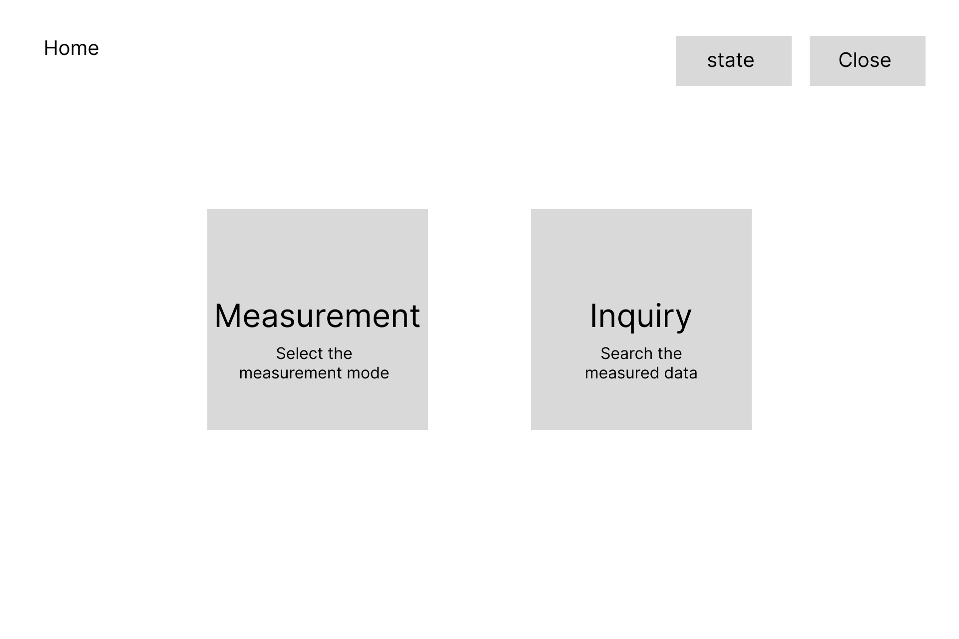
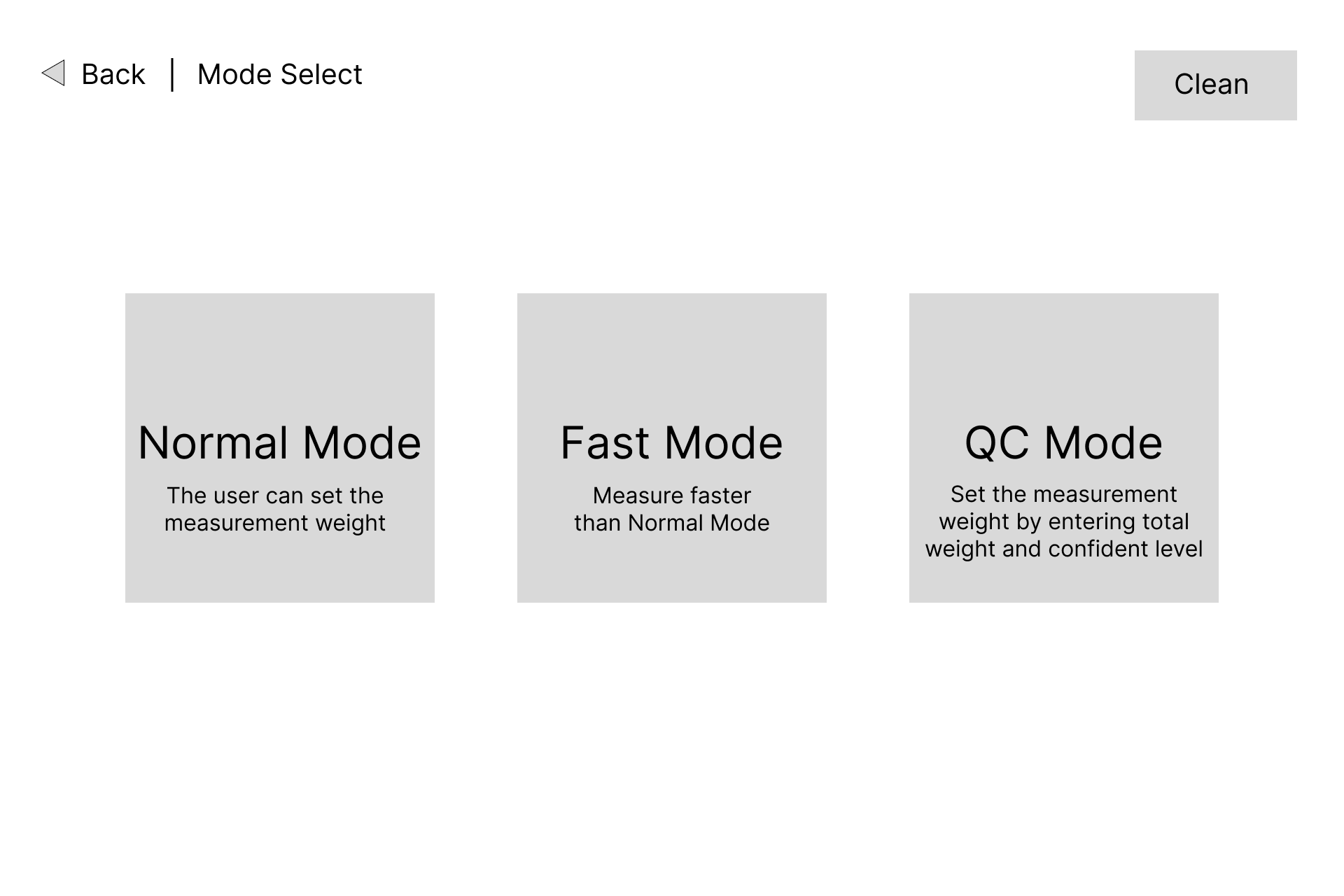
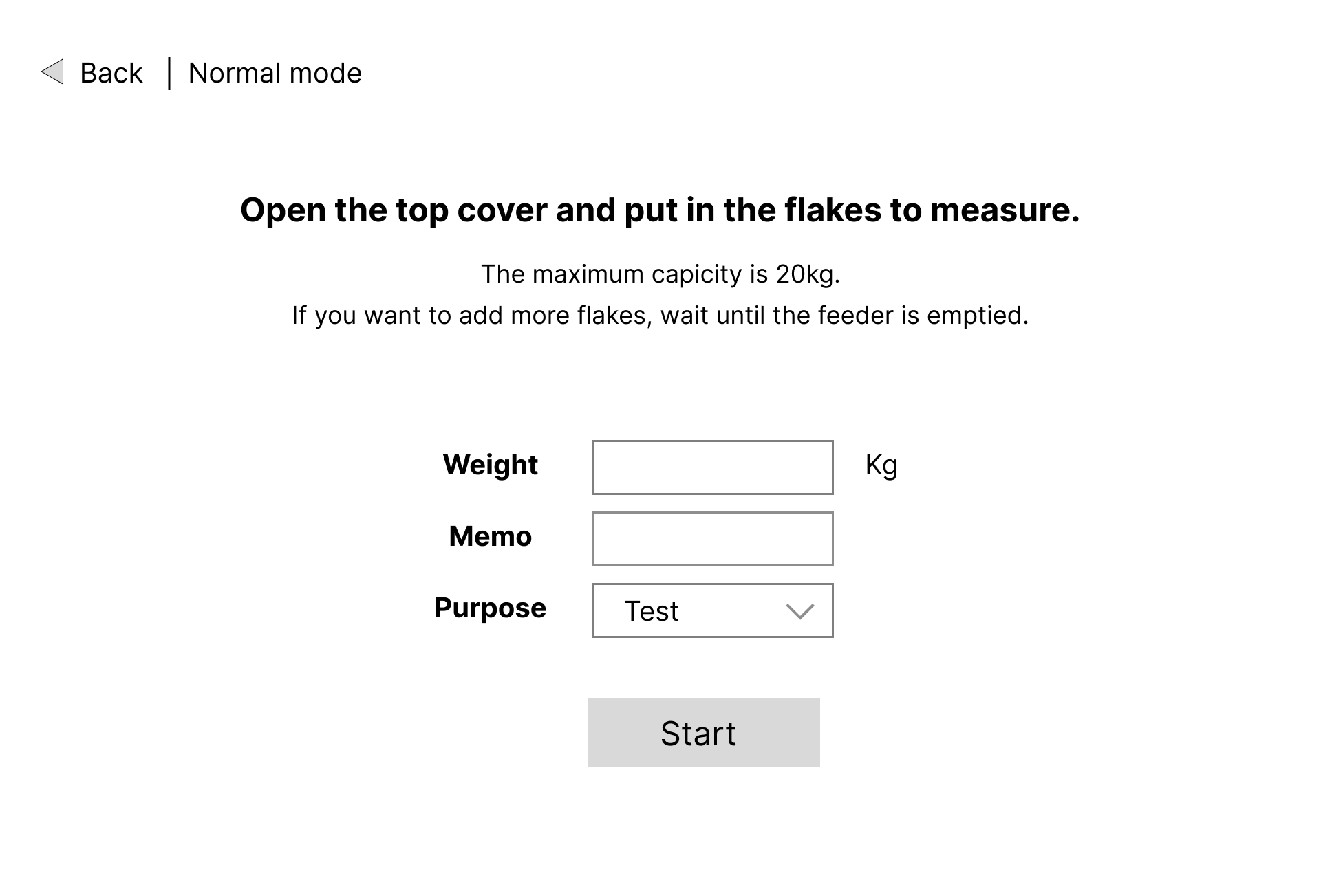
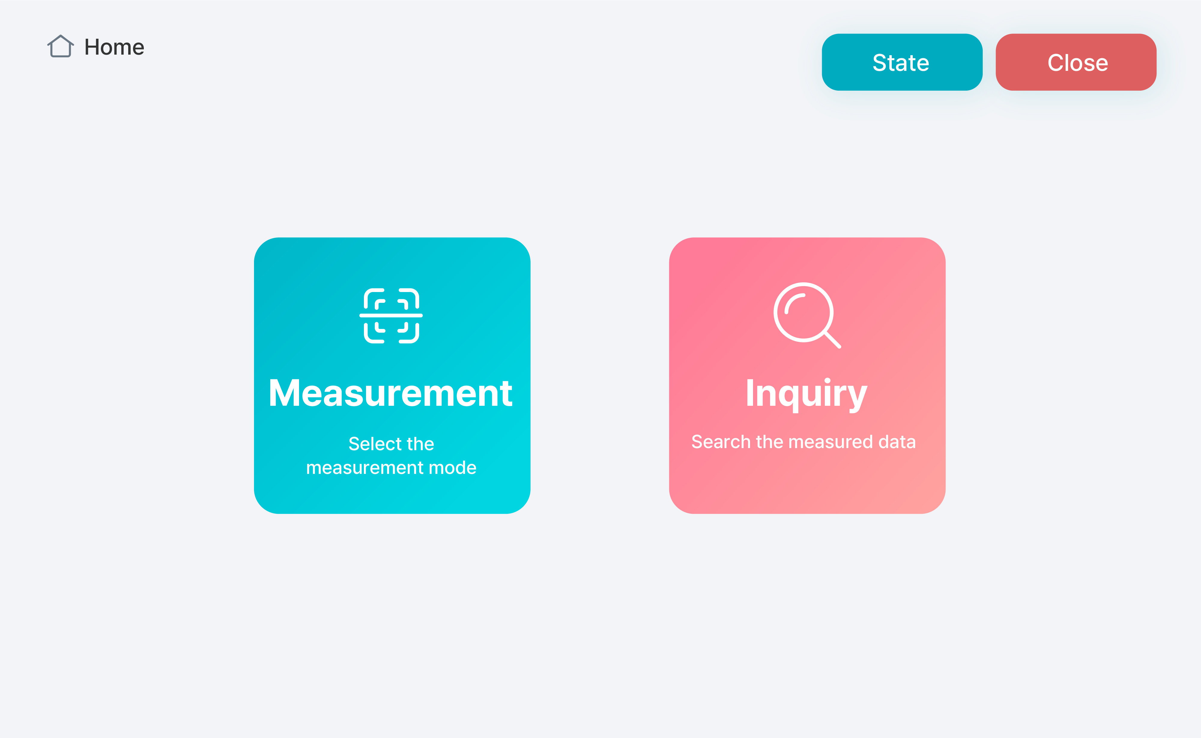
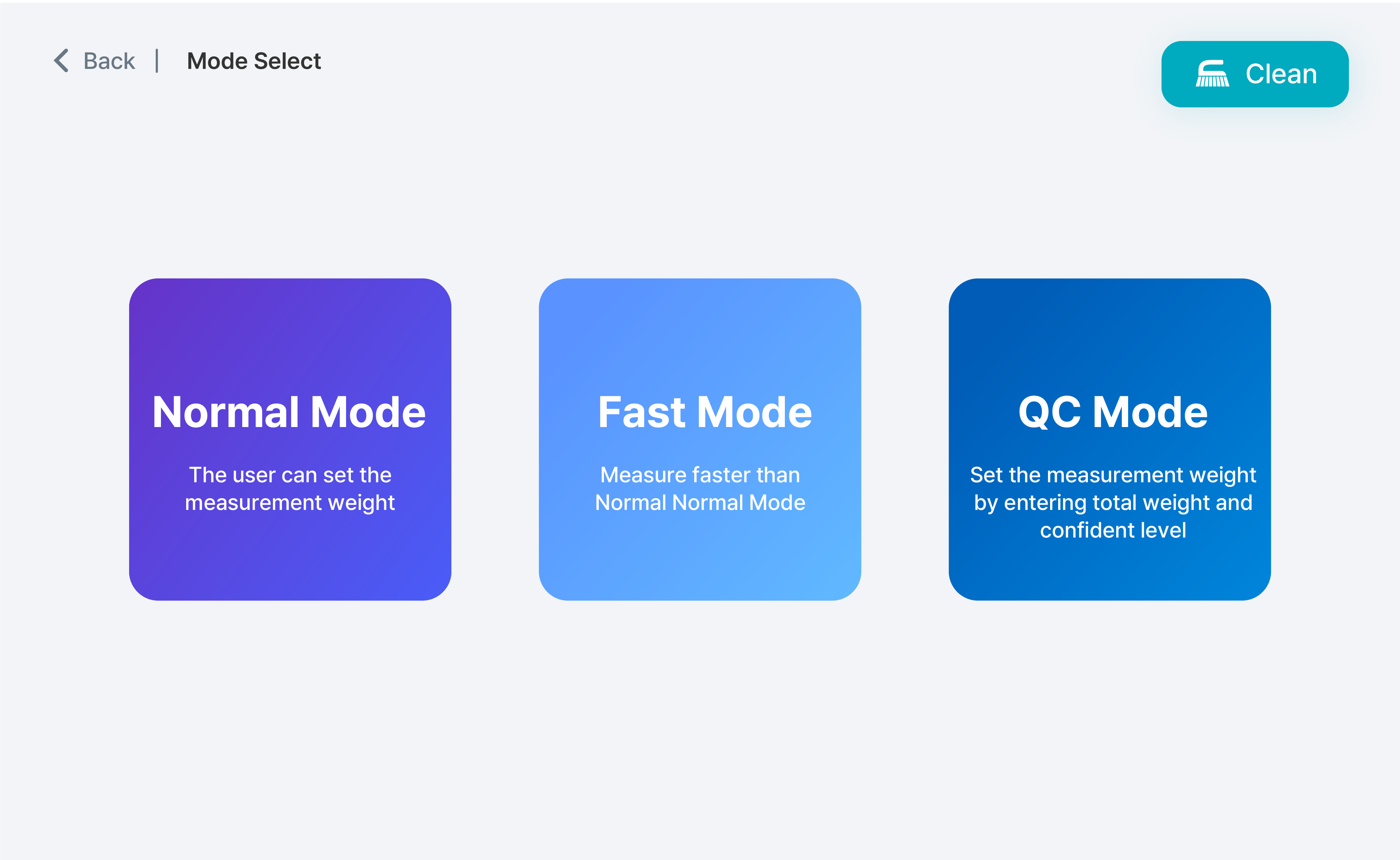
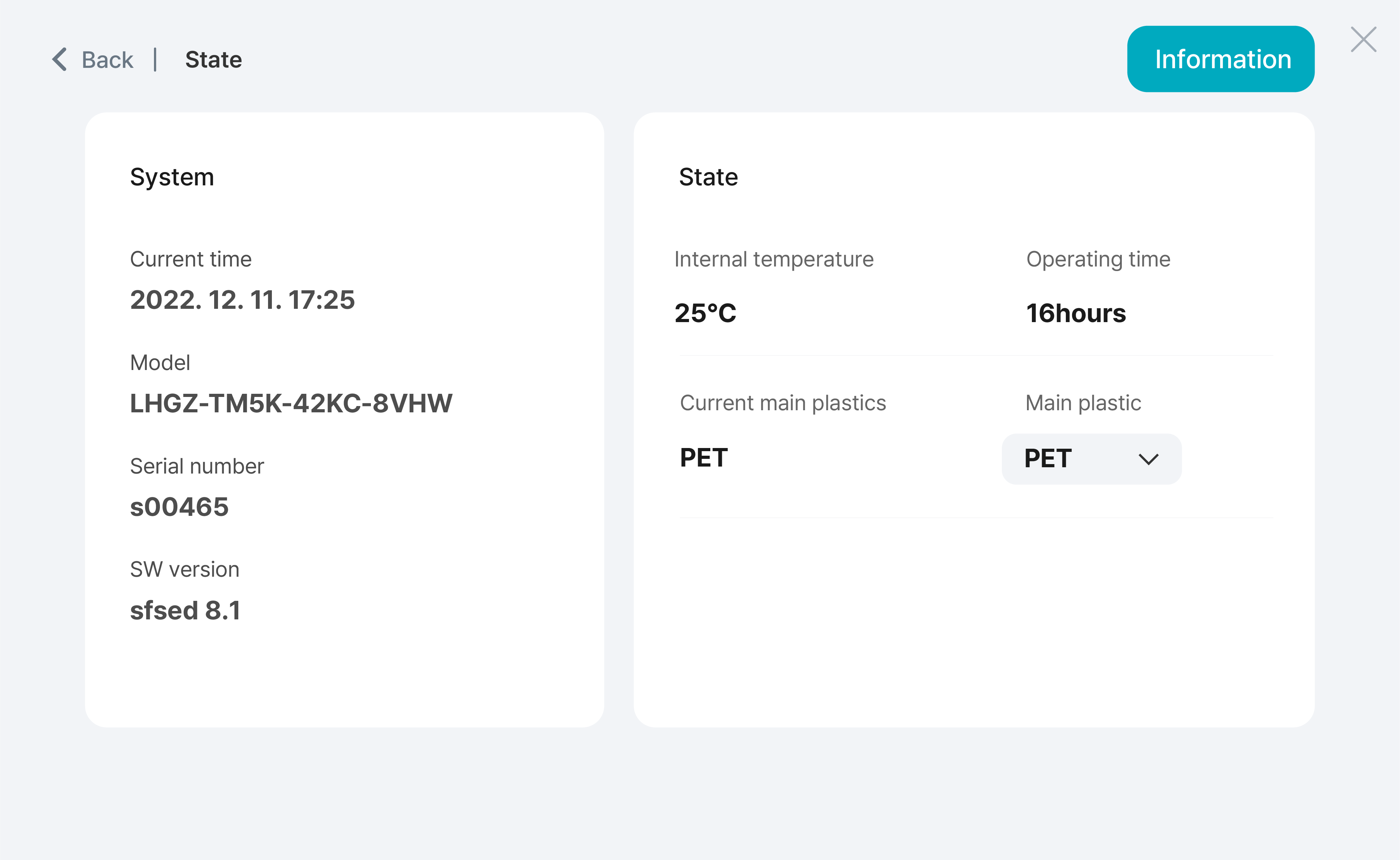
To provide a seamless user experience with the purity measurement machine, I focused on simplifying user interaction and ensuring easy access to key features. The machine offers three measurement functions and a data inquiry feature, and provides device status information and a cleaning function. With a focus on usability enhancement, the main screen was designed to promptly showcase buttons for measurement and data retrieval upon loading, facilitating users in selecting their desired destination. Device status information was prominently displayed on the first screen, and the cleaning function, which was performed after the measurement, can be easily accessed from the measurement screen. By implementing these design choices, I aimed to streamline the user experience and optimize efficiency in using the machine.
Design Choices
The design features a visually comfortable gray background, with mint color used as the primary button color to match the logo color. Red was used for buttons related to stopping, ending, or deleting, while blue was used to indicate functional distinctions. Gradient effects were applied to the measurement, access, basic measurement, quick measurement, and quality certification buttons to add aesthetic appeal and signify their status as the main functions used in practice.
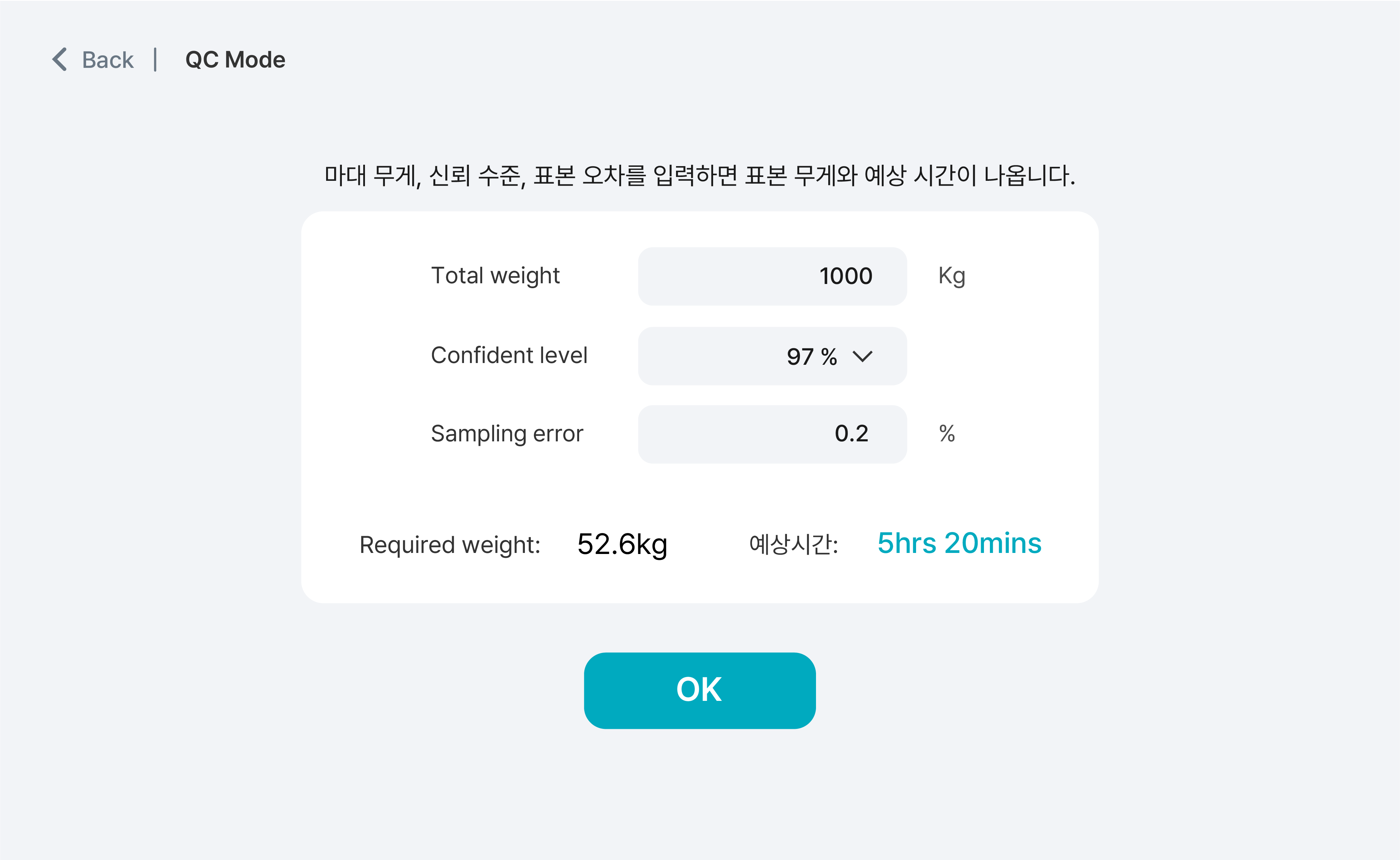
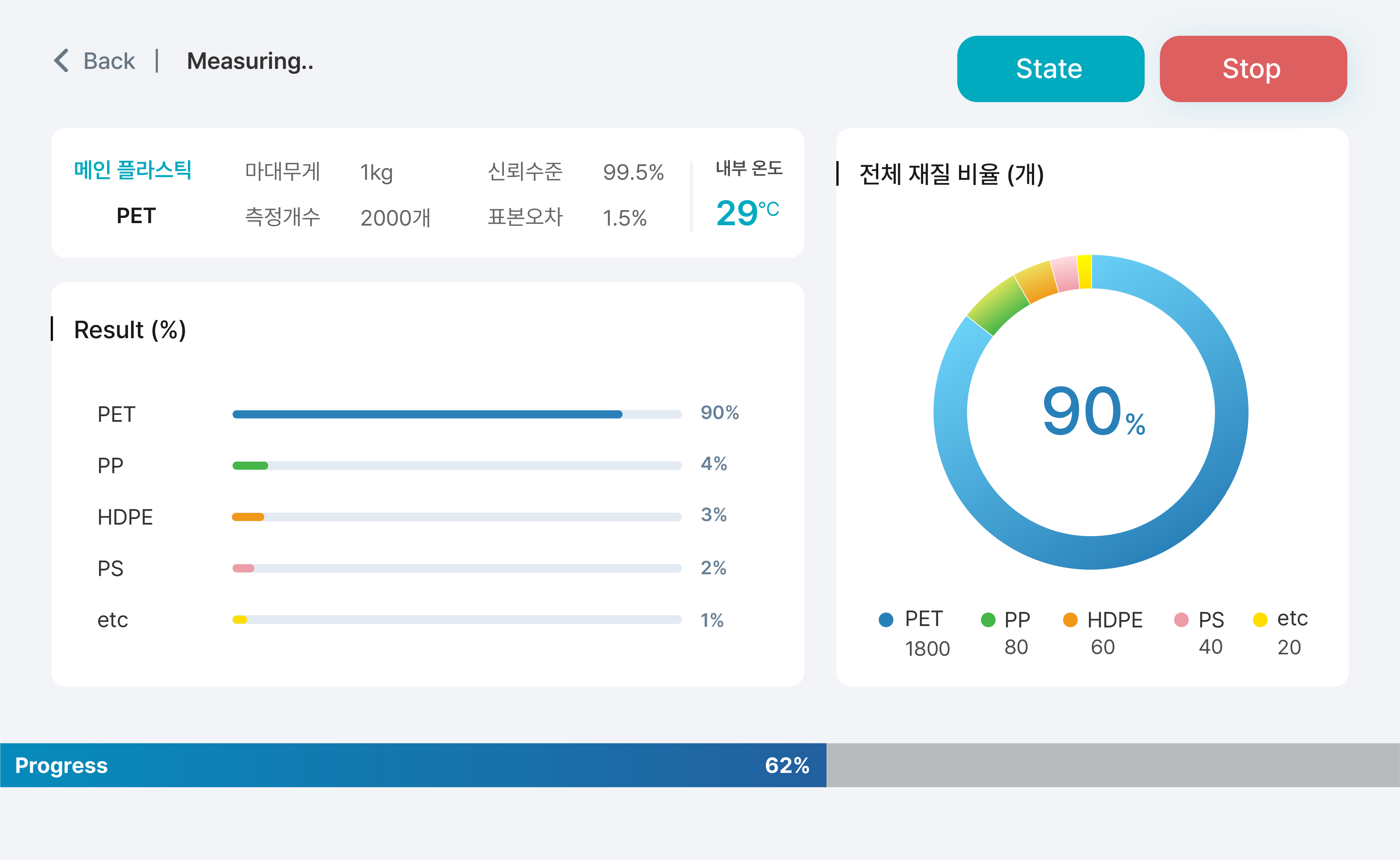
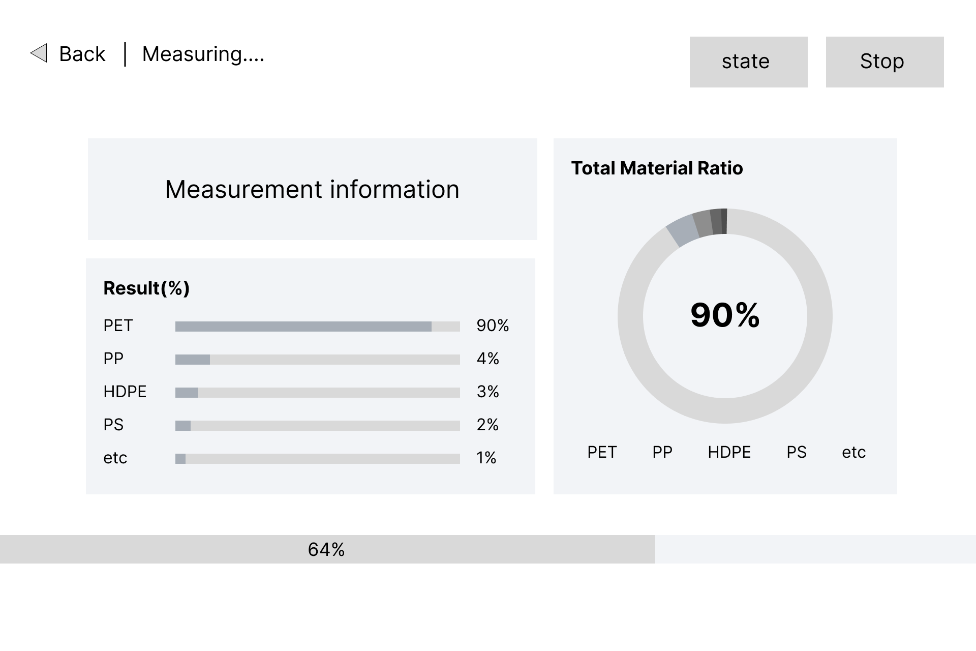
I meticulously designed the screen showcasing the main features of the product, with a particular focus on highlighting the purity percentage of the main plastic material. Using a circular diagram strategically, I ensured that the percentage takes center stage, allowing users to quickly grasp the most important information. Subsequently, for users interested in delving into more detailed information, I displayed the number of plastics below and on the left side, the percentage of other materials. This deliberate arrangement facilitates a seamless transition from checking the essential details to exploring more in-depth information. Details such as the weight of the measured plastic, the number of measurements, confidence level, sample error, and internal temperature are clearly separated in the top-left section for easy identification.
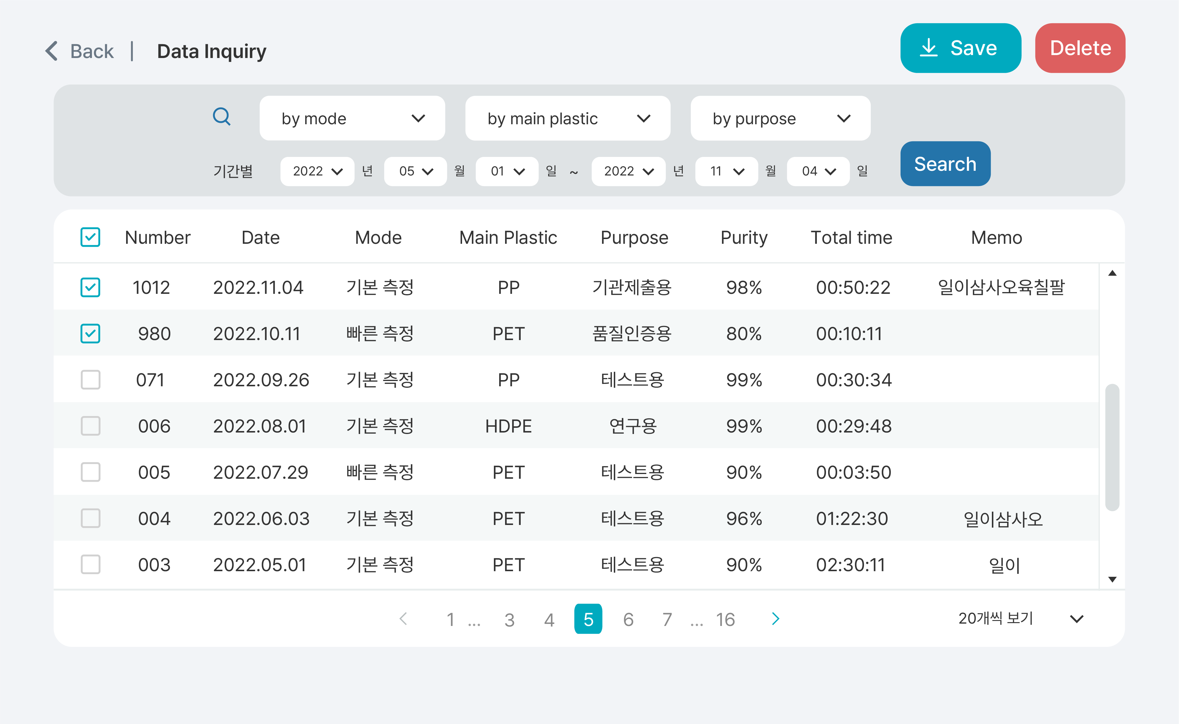
The inquiry selection section was neatly separated with different background colors to ensure clean distinction. Each important button was assigned a different color for classification. Icons were employed to improve visibility and aid comprehension of functions, with suitable icons accompanying the inquiry field and save button. The table was displayed with a light green background to maintain a clean and well-defined separation.
Outcome and Learning
The development of user-friendly firmware contributed to increased positive feedback from
potential customers during the product showcase, resulting in heightened interest and ease of use.
I learned how to plan and develop programs for machines, acquiring valuable experience in presenting information
in the most intuitive and effective form. This involved creating user-friendly designs tailored to specific target audiences.
My learning extended to establishing a cohesive design strategy by defining common design elements.
Throughout this process, I also acquired skills in effective communication and collaboration with developers.